Nieuwsmedia
De Morgen and de Volkskrant win design awards
HOW DO YOU MAKE SURE EVERY PAPER IS A GEM?
If anyone can answer this question, it’s Floris Hoorelbeke (Art director at De Morgen) and Koos Jeremiasse (Art director at de Volkskrant), as evidenced by their papers’ award-winning designs. “We have something to prove every day.” Obviously, they themselves designed these next few pages.


Interview art director De Morgen
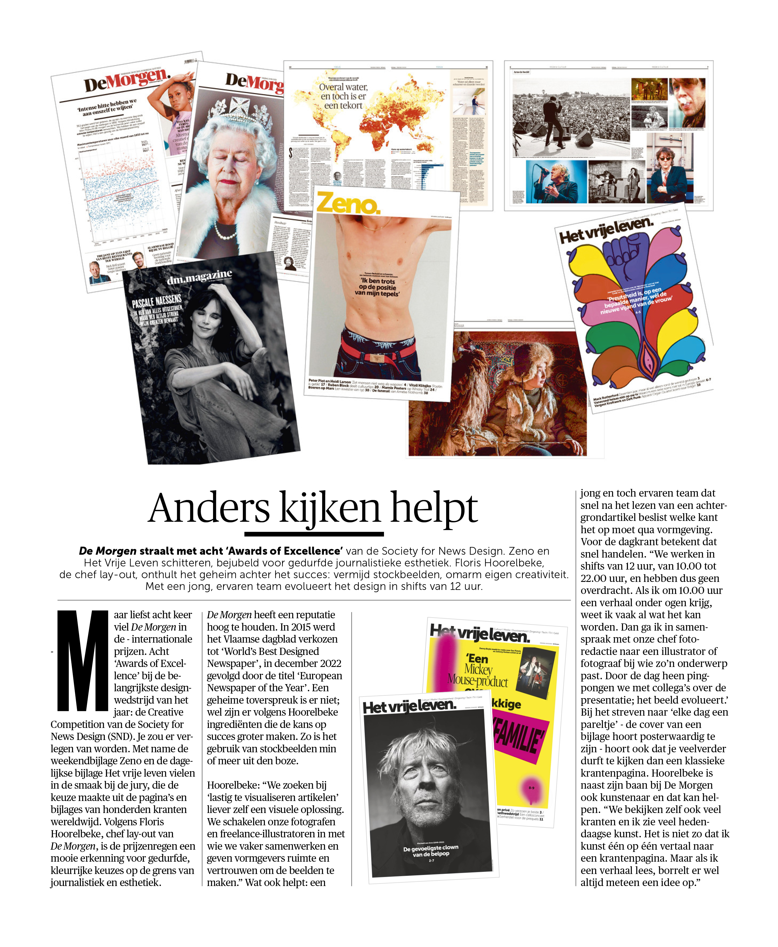
It helps to change your perspective
De Morgen is basking in the glow of the eight ‘Awards of Excellence’ it received from the Society for News Design, with the bold journalistic aesthetics of Zeno and Het vrije leven stealing the show. Art director Floris Hoorelbeke reveals the secret behind the paper’s success: avoid stock images and embrace your own creativity. The ever-evolving design is produced by a young but experienced team working 12-hour shifts.
In 2023, De Morgen managed to rake in no fewer than eight international ‘Awards of Excellence’ at the most important design competition of the year, the Society for News Design’s Creative Competition – it was almost embarrassing, really. The paper’s weekend supplement Zeno and daily supplement Het vrije leven particularly caught the eye of the judges, who looked at pages and supplements from hundreds of newspapers worldwide. According to Floris Hoorelbeke, De Morgen’s Art director, the shower of awards is a great show of recognition for bold, colourful choices that straddle the line between journalism and aesthetics.
De Morgen has a strong reputation to uphold. In 2015, the Flemish daily was voted the World’s Best Designed Newspaper, followed by the title of European Newspaper of the Year in December 2022. Although there is no magic formula, Hoorelbeke says there are certain ingredients that increase the chances of success. For instance, the use of stock images is more or less taboo.
“For articles that are ‘difficult to visualise’, we prefer to look for a visual solution ourselves. We engage our go-to photographers and freelance illustrators and give designers the freedom and confidence to create images.” It also helps to have a young but experienced team that can read a background article and quickly decide on a design approach. For the daily newspaper, that means fast-paced work. “We do 12-hour shifts, from 10 a.m. to 10 p.m., so there’s no handover. When I look at a story first thing in the morning, I usually have a picture in my head of what it could look like right away. Then I’ll consult with our head of photography and call an illustrator or photographer who’s right for the subject. Throughout the day, as we go back and forth with our colleagues about how to present the story, the image evolves.”
Striving for ‘a gem every day’ – the cover of a supplement should be poster-worthy – also means you have to be bold enough to disregard the classic template for a newspaper page. In addition to his job at De Morgen, Hoorelbeke is also an artist, which helps. “We look at a lot of other newspapers as well, and I see a lot of contemporary art. It’s not that I translate art directly to newspaper pages, but when I read a story an idea will always pop into my head immediately.”
Lees meer
Interview art director De Volkskrant
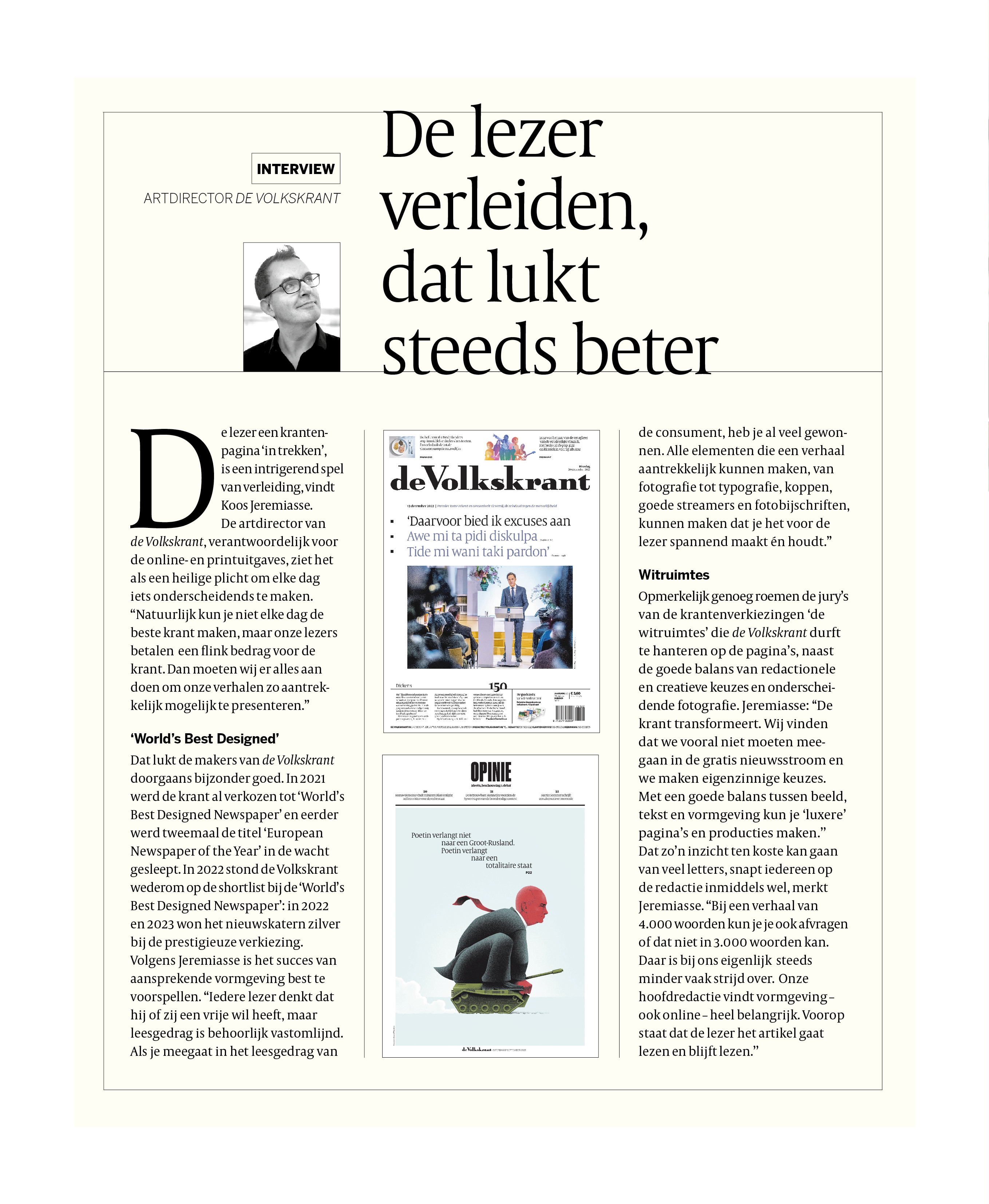
Refining the craft of seducing the reader
Drawing the reader into a newspaper page is an intriguing game of seduction, according to Koos Jeremiasse.
As de Volkskrant’s Art director, who is responsible for both the online and print edition, he sees it as his sacred duty to create something distinctive every day. “Of course, you can’t make the best newspaper every single day, but our readers pay good money for their paper. So we have to do everything we can to present our stories as attractively as possible.”
‘World’s Best Designed’
This is something de Volkskrant usually manages to do quite well. Before being voted the World’s Best Designed Newspaper in 2021, it had already won the title of European Newspaper of the Year twice. In 2022, it was again shortlisted for World’s Best Designed Newspaper, and the news section won silver in the prestigious contest – a prize it won again last year. Jeremiasse believes it’s possible to predict a design’s appeal. “Every reader thinks they have free will, but reading behaviour is pretty fixed. If you adapt your design to suit consumers’ reading habits, you’ve already won half the battle. All the elements you can use to make a story attractive, from photography to typography, headlines, good streamers and captions, can help keep things exciting for the reader.”
White spaces
Remarkably, the judges who awarded de Volkskrant praised ‘the white spaces’ it dares to use on its pages, in addition to the good balance between editorial and creative choices, and the paper’s distinctive photography. “The newspaper is transforming,” says Jeremiasse. “We strongly believe that we shouldn’t go along with the free news trend, and we make idiosyncratic choices. By striking the right balance between image, text and design, you can create more ‘luxurious’ pages and productions.” The fact that this can come at the cost of a large number of words is something everyone on the editorial team understands by now, Jeremiasse finds. “When you’ve got a 4,000-word story, you can sometimes ask yourself if you can’t make do with 3,000 words. That’s becoming less of a battleground over here. Design is very important to our chief editors, also when it comes to the online edition. The main thing is that people are enticed to read the article, and that they keep reading.”
Lees meer